Landing Page Design: How to Build a Page That Turns Visitors Into Customers

Most small business owners in India send traffic to their homepage. Few send it to a landing page built for one job. That gap quietly wastes every rupee they spend on ads.
Here’s what happens. You run a Google Ad for your service. A customer in Dehradun taps it. They land on your busy homepage, see ten different links, and don’t know what to do next. They tap back to Google. That click cost you money. You got nothing for it.
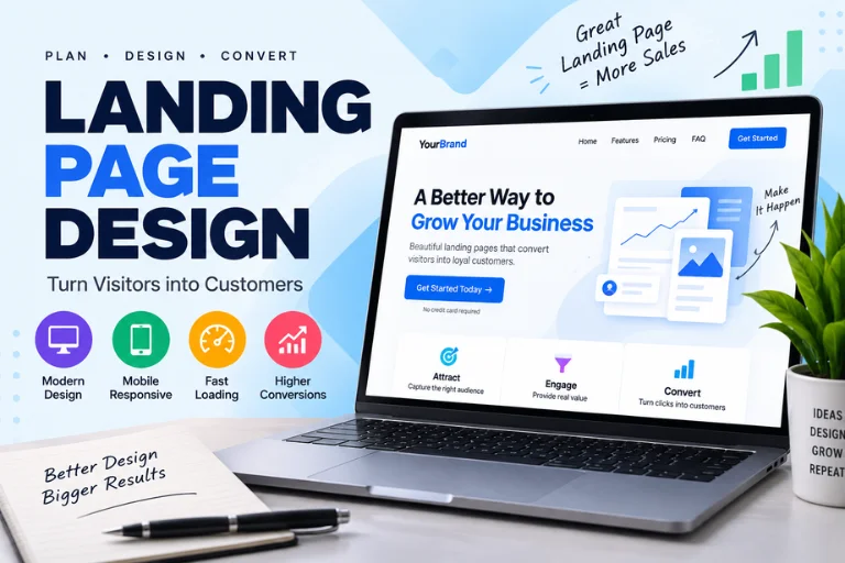
A landing page fixes that. It’s a single page built to do one thing — get the visitor to call, book, or fill in a form. No distractions. No dead ends. Just a clear path from arrival to enquiry.
This guide fixes the confusion. You’ll learn what landing page design is, the principles that make a page convert, the mistakes that drain your budget, and how to build a page that earns enquiries. No design background needed.
Quick answer: Landing page design means building a single web page focused on one goal — turning a visitor into a lead or customer. A good one has a clear headline, one obvious call to action, trust signals, and fast load times on mobile. Strip out the menu and extra links, and guide every visitor toward one action.
Table of Contents
What Landing Page Design Is
Landing page design is the practice of building a single web page around one specific goal.
Break that down. A landing page is the first page someone “lands” on after tapping an ad, a link, or a search result. Design here means more than looks — it’s how the whole page guides a visitor toward one action.
A homepage tries to do everything. It shows your services, your story, your blog, your contact details, and links to twenty other pages. That’s fine for browsing. It’s poor for converting.
A landing page does the opposite. It has one goal and removes everything that doesn’t serve it. No cluttered menu. No side-tracks. One message, one offer, one button.
Here’s a simple example. A salon in Dehradun runs an ad for a bridal package. The ad should not point to the homepage. It should point to a landing page about the bridal package — with photos, the price, and a “Book on WhatsApp” button. One offer. One next step.
The key takeaway: a landing page is a focused tool, not a general website. Get the focus right and more visitors become customers.
Key Principles of Landing Page Design
Good landing pages follow a few clear rules. Get these right and your page earns enquiries. Here are the five that matter most.
A clear, specific headline
Your headline is the first thing a visitor reads. It has two seconds to tell them they’re in the right place.
Make it specific. “Bridal Makeup in Dehradun — Book Your Trial Today” beats “Welcome to Our Salon.” A vague headline loses the visitor. A specific one confirms they found what they searched for. Match your headline to the ad or link that brought them there.
One obvious call to action
A call to action, or CTA, is the button that tells the visitor what to do next — “Book Now,” “Call Us,” “Get a Free Quote.”
Pick one action per page. Make the button big, bold, and easy to tap on a phone. Repeat it down the page so it’s always in reach. When you offer five choices, visitors freeze and pick none. One clear button beats a wall of options.
Strong visuals
Show, don’t just tell. A landing page needs real images that support the offer.
Use photos of your actual shop, team, or work — not generic stock images everyone has seen. A dentist’s landing page should show the real clinic. Compress every image to under 100 KB so the page stays fast. Good visuals build trust before a single word is read.
Trust signals
A trust signal is anything that reassures a visitor you’re real and reliable — reviews, ratings, photos, or a clear address and phone number.
People hesitate before they contact a business they don’t know. Genuine Google reviews, a visible phone number, and a real Dehradun address remove that hesitation. Add only what’s true. A fake testimonial does more harm than none.
Speed
A landing page must load fast — under three seconds, ideally closer to two.
Speed is a design principle, not just a technical one. Most of your visitors arrive on a phone, often on mobile data. Every extra second sends people away before your offer even appears. Compress images, keep the page light, and it loads quickly even on a weak signal.
Good vs Poor Landing Page: A Quick Comparison
This table shows the difference between a page that converts and one that leaks money. Check yours against it.
| Feature | Poor Landing Page | Good Landing Page |
| Goal | Tries to do everything | One clear goal |
| Headline | Vague or generic | Specific and matches the ad |
| Navigation menu | Full menu, many exits | Removed or minimal |
| Call to action | Hidden or several competing | One, bold, repeated |
| Images | Generic stock photos | Real, compressed photos |
| Trust signals | None visible | Reviews, phone, address |
| Load time | 5+ seconds | Under 3 seconds |
| Mobile view | Cramped, hard to tap | Clean, easy to tap |
| Result | Wasted ad spend | Visitors become enquiries |
The key takeaway: a good landing page isn’t prettier. It’s focused. And focus is what turns clicks into customers.
How to Design a Landing Page: Step by Step
You don’t need to be a designer to follow these. Work through them in order.
Step 1: Define one goal
Decide the single action you want — a call, a WhatsApp message, or a filled form. Everything on the page serves that one goal. Write it down before you build anything.
Step 2: Write a headline that matches the ad
Your headline must echo the ad or search that brought the visitor. If your ad says “Affordable Dental Checkup,” your headline should too. This confirms they’re in the right place and keeps them reading.
Step 3: Put the offer above the fold
“Above the fold” means the part of the page visible before scrolling. Place your headline, main image, and CTA button here. A visitor should understand the offer and see the button without scrolling.
Step 4: Add one clear call to action
Use a bold button with plain words — “Book on WhatsApp” or “Call Now.” Make it large enough to tap easily on a phone. Repeat the same button further down the page.
Step 5: Keep the form short
If you use a lead form, ask only for what you need — name and phone number is often enough. Every extra field loses a few more people. A short form fills faster.
Step 6: Add trust signals
Include two or three genuine Google reviews, your phone number, and your real address. For a local business, a Dehradun address tells nearby customers you’re close and reachable.
Step 7: Remove the menu and extra links
Strip out the navigation menu and any link that pulls the visitor away. Every exit is a lost enquiry. Keep the page focused on your one goal.
Step 8: Test on a real phone
Before you go live, open the page on an actual phone. Tap the button. Fill in the form. Check that images load fast and nothing overflows the screen. Most Indian visitors will see this version first.
Common Landing Page Design Mistakes to Avoid
These errors quietly drain your ad budget. Check your page against each one.
Sending ad traffic to your homepage. A homepage has too many exits. Every ad should point to a focused landing page built for that offer.
Using more than one call to action. Five buttons confuse the visitor. Pick one goal and one button, repeated down the page.
Writing a vague headline. “Welcome to our website” tells the visitor nothing. Be specific about the offer and the place.
Skipping trust signals. Without reviews, a phone number, or an address, a stranger has no reason to trust you. Add genuine proof.
Uploading heavy images. A photo straight from a phone can weigh 5 MB and drag your load time to a crawl. Compress every image first.
Asking for too much in the form. A ten-field form scares people off. Ask for the minimum and follow up later.
Ignoring mobile. A page that only works on a laptop fails the audience that matters most. Test the phone view every time.
How NayaLogic Can Help
Building a landing page that converts takes skill and time. Writing the headline, choosing real photos, compressing images, setting up the form, and testing it on mobile often takes 10 to 15 hours for a first-timer. Most business owners in Dehradun and across Uttarakhand don’t have those hours to spare.
That’s where NayaLogic comes in. We’re a digital growth agency based in Dehradun, and building focused, fast landing pages is part of what we do. Our website development work covers the full build — a clear headline, real compressed images, one strong call to action, trust signals, and a mobile-first layout that turns visitors into enquiries.
A landing page also needs traffic to work. Our SEO services help the right customers find your page through search, so your design work reaches real buyers, not empty clicks.
Once a visitor taps your button, the next step is replying fast. We build WhatsApp and AI automation that answers enquiries and takes bookings 24/7 — even when your shop is closed. A customer visits your page at 11 p.m., taps WhatsApp, and gets an instant reply. Every enquiry gets answered. Every booking gets confirmed. Automatically.
You don’t need any technical background to work with us. We explain every step in plain language and support both Hindi and English.
Build a Page That Earns Enquiries, Not Just Clicks
Landing page design isn’t about looking impressive. It’s about focus. One goal, one clear headline, one obvious button, real trust signals, and fast load times on mobile. Strip away the distractions and guide every visitor toward one action.
Get that right and your page does more than sit there. It turns the clicks you already pay for into real customers.
Your competitors are already building focused pages. The sooner you fix yours, the sooner you stop wasting ad spend on visitors who leave.
Want it handled by people who do this every day? Book a free demo with NayaLogic and get a landing page built to convert.
Frequently Asked Questions
What is the difference between a landing page and a homepage?
A homepage introduces your whole business — services, story, blog, and links to many pages. It’s built for browsing. A landing page focuses on one goal, like booking a service or getting a quote, and removes everything else. Send your ad traffic to a landing page, not your homepage. The focus turns more visitors into enquiries, because there’s only one clear next step to take.
How long should a landing page be?
Long enough to make your case, short enough to keep attention. For a simple offer, a short page with a headline, a few benefits, trust signals, and a button works well. For a higher-priced service, add more detail and reviews to build confidence. What matters is not length but focus. Every section should push the visitor toward your one goal.
Do I need a separate landing page for each ad?
Yes, ideally. Each ad promises something specific, and the landing page should match that promise. If your ad is about bridal makeup, sending visitors to a general salon page loses them. A matching landing page confirms they’re in the right place and keeps them moving toward booking. One focused page per offer usually earns far more enquiries than one page for everything.
How much does a landing page cost in India?
It depends on the design, the copy, and the features involved. A simple, well-built landing page costs far less than a full multi-page website. Doing it yourself costs mainly your time plus hosting. Hiring an agency costs more but saves hours and usually converts better. Compare that to wasted ad spend — a poor page can lose thousands in clicks. For an exact quote, book a free demo with NayaLogic.
What makes a landing page convert well?
Focus. A clear, specific headline that matches the ad. One obvious call to action, repeated down the page. Real photos, not stock images. Genuine trust signals like Google reviews and a visible phone number. Fast load times on mobile. Remove the menu and extra links so the visitor has one path forward. Get these right and more of your clicks become real enquiries.
Can I build a landing page myself without a designer?
Yes, with the right tools. Modern page builders let you design a page by dragging and dropping, no coding needed. This guide covers the principles to follow. The real question is time. A first attempt often takes 10 to 15 hours, including learning as you go. If you’d rather run your business, an agency like NayaLogic can build and test it for you.
Why is my landing page getting clicks but no enquiries?
Usually one of a few reasons. Your headline may not match the ad, so visitors feel they landed in the wrong place. Your call to action might be hidden or unclear. The page could load too slowly on mobile. Or there are no trust signals to reassure a stranger. Test the page on a real phone, watch someone try to enquire, and fix wherever they get stuck.