

UI vs UX: What’s the Difference and Why It Matters for Your Website

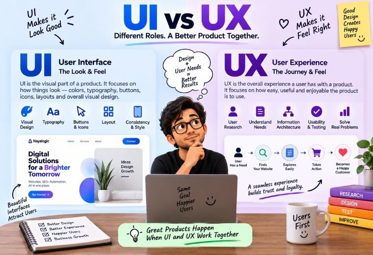
Quick answer: UI stands for User Interface — how your website looks. Colours, buttons, fonts, spacing. UX stands for User Experience — how your website feels to use. How easy it is to find information, book a service, or contact you. UI is the paint and furniture. UX is whether the house is easy to live in. A good website needs both.
Table of Contents
Most small business owners in India hear the words “UI” and “UX” and treat them as the same thing. They aren’t. That confusion leads to websites that look good but lose customers — or work fine but look cheap.
Here’s what happens. You hire someone to build your site. They show you a pretty homepage. You approve it. Then a customer in Dehradun visits, can’t find your phone number, gets frustrated, and taps back to Google. The site looked great. It just didn’t work.
That’s the gap between UI and UX. One is how your site looks. The other is how it feels to use. Get one right and skip the other, and you lose sales you never even see.
This guide fixes that. You’ll learn what UI and UX actually mean, how they differ, why your business needs both, and the mistakes that quietly cost you customers. No design background needed.
What UI Means
UI stands for User Interface. It’s everything a visitor sees and touches on your website.
Break that down. “User” is your customer. “Interface” is the screen they interact with. So UI is the visual layer — the part your customer looks at and taps.
UI covers the concrete, visible things:
- Colours — your brand palette and how it’s used across the page.
- Buttons — their size, shape, colour, and the words on them.
- Fonts — the typefaces and text sizes people read.
- Spacing — the gaps between elements that keep a page clean.
- Images and icons — the visuals that support your message.
Think of UI as the look of a shop. The signboard, the paint, the shelf layout, the lighting. It’s what makes a first impression in the first two seconds.
Good UI signals a business that pays attention to detail. A visitor in Dehradun judges your credibility fast. A clean, professional interface tells them you’re worth trusting before they read a single word.
What UX Means
UX stands for User Experience. It’s how easy and pleasant your website is to actually use.
Break that down. UX is not about how a page looks. It’s about how it works. Can a visitor find what they need? Can they book a service in a few taps? Can they reach you without hunting?
UX covers the invisible things that shape how a visit feels:
- Navigation — how easily someone moves between your pages.
- Flow — the path from landing on your site to sending an enquiry.
- Speed — how fast pages load, especially on mobile data.
- Clarity — whether the next step is always obvious.
- Ease of contact — how quickly a customer can call, WhatsApp, or book.
Think of UX as the experience of shopping in that same shop. Can you find what you came for? Is the aisle clear? Is checkout quick? A beautiful shop with a confusing layout still sends people away empty-handed.
Here’s the key. A visitor rarely says “the UX was bad.” They just leave. They feel frustrated, tap back, and you never know why. That’s what makes UX so easy to ignore — and so expensive to get wrong.
UI vs UX: A Quick Comparison
This table shows the difference at a glance. Check your own website against both columns.
| Aspect | UI (User Interface) | UX (User Experience) |
| What it means | How the site looks | How the site feels to use |
| Focus | Visual design | Usability and flow |
| Covers | Colours, fonts, buttons, spacing | Navigation, speed, clarity, contact |
| The question it answers | “Is this attractive?” | “Is this easy to use?” |
| Felt by the visitor | In the first 2 seconds | Throughout the whole visit |
| When it fails | The site looks cheap | The visitor gives up and leaves |
| Real-world comparison | A shop’s paint and signboard | The shop’s layout and checkout |
The key takeaway: UI and UX are not rivals. They’re partners. A great-looking site nobody can use fails. A usable site that looks cheap loses trust. You need both working together.
Why Both Matter for Your Business Website
UI and UX aren’t design theory. They’re business numbers. Here’s what getting both right earns you.
More enquiries. Good UX guides a visitor straight to your contact button. Good UI makes that button impossible to miss. Together, they turn browsers into leads.
Stronger trust. People judge your business by your website in seconds. A clean interface and a smooth experience signal a business worth buying from.
Better Google rankings. Google favours fast, mobile-friendly, easy-to-use sites. Solid UX helps you rank above a slower, clunkier competitor targeting the same customers.
Lower ad costs. If you run Google Ads, a clear, fast landing page lowers your cost per click. Google charges more when a page frustrates visitors.
Fewer lost customers. Every confusing menu and hidden button loses a sale. Fix the experience and you keep the visitors you already worked to attract.
Picture the maths. If your average sale is ₹3,000 and a poor website loses you 10 enquiries a month, that’s ₹30,000 in lost revenue every month. A site that looks good and works well pays for itself fast.
Practical Tips to Get UI and UX Right
You don’t need to be a designer to apply these. Follow them in order.
- Design for the phone first. Most Indian visitors reach you on a mobile. Build and check every page on a phone screen before the desktop.
- Make one action obvious per page. Decide what you want — a call, a booking, a WhatsApp message. Design the page around that single step.
- Keep navigation simple. Aim for five or six menu items. A visitor should reach any page in two taps.
- Use one brand colour and one or two fonts. Consistency looks professional. Five fonts and eight colours look messy.
- Make your contact options visible everywhere. Put your phone number and a WhatsApp button in the header, on every page.
- Compress your images. A photo straight from a phone can weigh 5 MB. Compress every image to under 100 KB so pages load fast.
- Write short, scannable text. Use headings, short paragraphs, and bullets. Most people scan before they read.
- Test with a real person. Ask someone outside your business to book a service on your site. Watch where they get stuck. Fix that.
By now, you should be able to look at your own website and spot which side — UI or UX — is letting you down.
Common UI and UX Mistakes to Avoid
These errors quietly cost you customers. Check your site against each one.
Choosing looks over usability. A stunning homepage that hides the contact button loses leads. Pretty isn’t the goal. Enquiries are.
Ignoring mobile. A site that only works well on a laptop fails the audience that matters most. Test the phone view every time.
Cramming everything onto one page. Too much at once overwhelms visitors. Give each idea room and lead people to deeper pages.
Hiding the next step. A page with no clear call to action leaves visitors stuck. Always tell them what to do next.
Using tiny or fancy fonts. A stylish font nobody can read on a phone costs you readers. Choose clarity over cleverness.
Skipping the speed check. A slow site ruins even the best design. Compress images and test your load time on mobile data.
Chasing trends over function. Flashy animations often slow your site and distract from your message. Keep it clean and purposeful.
How NayaLogic Can Help
Getting UI and UX right takes skill and time. Balancing a clean look with a smooth experience, building mobile-first layouts, compressing images, and testing the flow often takes 20 to 30 hours for a first-timer. Most business owners in Dehradun and across Uttarakhand don’t have those hours to spare.
That’s where NayaLogic comes in. We’re a digital growth agency based in Dehradun, and building sites that look good and work well is part of what we do. Our website development work covers the full build — clean visual design, phone-first layouts, fast load times, and a clear path that turns visitors into enquiries.
Design and search go together. A well-built, easy-to-use site ranks better, so our SEO services pair the experience work with the on-page work that helps customers actually find you.
Once they find you, the next step is replying fast. We build WhatsApp and AI automation that answers enquiries and takes bookings 24/7 — even when your shop is closed. A customer visits at 11 p.m., taps WhatsApp, and gets an instant reply. Every enquiry gets answered. Every booking gets confirmed. Automatically.
You don’t need any technical background to work with us. We explain every step in plain language and support both Hindi and English. Want to see the difference for your own business? Take a look at our website development service and book a free demo.
Get a Site That Looks Good and Works Well
UI and UX aren’t competing ideas. They’re two halves of the same job. UI makes your website attractive. UX makes it easy to use. Get both right and your site does more than sit there — it earns trust, ranks on Google, and turns visitors into enquiries.
Your competitors are already upgrading their sites. The sooner you fix yours, the sooner you stop losing customers to a confusing or dated screen.
Want it handled by people who do this every day? Book a free demo with NayaLogic and get a site that looks good and works well.
Frequently Asked Questions
What is the difference between UI and UX?
UI, or User Interface, is how your website looks — the colours, buttons, fonts, and spacing a visitor sees. UX, or User Experience, is how your website feels to use — how easily someone can find information, navigate pages, and contact you. Put simply, UI is the visual layer and UX is the overall journey. A good website needs both: an attractive interface and a smooth, frustration-free experience.
Is UI or UX more important for a small business website?
Neither works alone. A site with great UI but poor UX looks good yet loses customers who can’t find what they need. A site with strong UX but weak UI works well but feels cheap and loses trust. For a small business in India, both matter equally. The goal is simple: a website that looks professional and makes contacting you effortless.
Can I improve my website’s UX without hiring a designer?
Yes, to a degree. Simplify your menu to five or six items, add a visible WhatsApp button on every page, compress your images so pages load faster, and test the site on a real phone. These fixes take clicks, not code. For a full redesign that balances UI and UX properly, an agency like NayaLogic can handle it while you run your business.
How do UI and UX affect my Google ranking?
UX affects it directly. Google favours fast, mobile-friendly, easy-to-use sites, and it ranks the mobile version first. A slow, confusing site slips down the results. UI has an indirect effect — a clean, clear design keeps visitors on the page longer, which signals quality to Google. Together, good UI and UX help you rank above a clunkier competitor.
How much does a well-designed website cost in India?
It depends on the number of pages, features, and design work involved. A simple, well-built business site that balances UI and UX costs far less than a large custom store with online payments. Doing it yourself costs mainly your time. Hiring an agency costs more but saves weeks and usually delivers a stronger result. For an exact quote, book a free demo with NayaLogic.
What are the most common UI and UX mistakes?
The biggest ones are ignoring mobile users, hiding the contact details, cramming too much onto the homepage, using tiny fonts, and skipping a clear call to action. Slow load times from uncompressed images hurt too. Each of these quietly sends visitors away. Most Indian visitors browse on phones, so any mistake that frustrates a phone user costs you the audience that matters most.
How do I know if my website has a UX problem?
Watch for the signs. High visitor numbers but few enquiries usually mean people arrive and then leave, confused. Ask someone outside your business to book a service or find your phone number on your site. If they hesitate or get stuck, that’s your UX problem. A quick test on a real phone, over mobile data, reveals most issues fast.