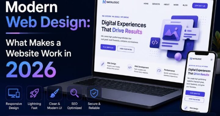

Mobile-Friendly Websites: Why Your Business Can’t Afford to Ignore Them


Most small business owners in India have a website. Few have one that works properly on a phone. That gap is quietly costing them customers every single day.
Here’s what happens. A customer in Dehradun searches for your service on their phone. They tap your link. The text is too small to read. The buttons are too close together to tap. They pinch, zoom, and struggle for a few seconds. Then they leave — back to Google, straight to your competitor.
You never see that lost customer. No missed call. No abandoned form. Just a visitor who arrived, got frustrated, and vanished. And if most of your traffic comes from phones — which it does in India — this happens more often than you think.
This guide fixes that. You’ll learn what mobile-friendly websites actually are, why they matter for your business, the principles that make a site work on phones, and a step-by-step way to fix yours. No technical background needed.
Quick answer: A mobile-friendly website is one that works well on a phone — text you can read without zooming, buttons you can tap easily, and pages that load fast on mobile data. You make a site mobile-friendly with responsive design, a mobile-first layout, compressed images, and simple navigation. Google ranks the mobile version of your site first, so this isn’t optional anymore.
Table of Contents
What Mobile-Friendly Websites Actually Are
A mobile-friendly website is one that adjusts to fit a phone screen and stays easy to use on it.
Break that down. On a laptop, your site has a wide screen to work with. On a phone, that same content has to fit a screen a fraction of the size. A mobile-friendly site reshapes itself to that smaller screen automatically — the text resizes, the layout stacks into a single column, and the buttons grow large enough to tap with a thumb.
An unfriendly site does none of this. It shows the full desktop version, shrunk down. The visitor has to pinch and zoom just to read a sentence. That’s the difference between a site that keeps a customer and one that loses them in three seconds.
Here’s a simple way to picture it. A mobile-friendly site is like a shop with a wide door and clear aisles — anyone can walk in and find what they need. An unfriendly site is like a shop with a doorway you have to squeeze through sideways. Most people just won’t bother.
The key takeaway: mobile-friendly isn’t a nice extra. In India, where most people browse on phones, it’s the baseline your site has to meet.
Why Mobile-Friendly Websites Matter for Your Business
This isn’t design theory. It’s a business number. Here’s what a mobile-friendly site earns you.
Google ranks you higher. Google uses mobile-first indexing — it looks at the phone version of your site to decide where you rank. If your mobile site is poor, your rankings suffer, even for people searching on a laptop. You can confirm this in Google’s own mobile-first indexing documentation.
You keep more visitors. Most Indian visitors reach you on a phone, often on mobile data. A site that’s hard to use on a phone loses the exact audience you most want to reach.
You earn more enquiries. A visitor who can read your page and tap your button easily is a visitor who contacts you. Struggle costs you the lead.
You spend less on ads. If you run Google Ads, a poor mobile landing page raises your cost per click. Google charges more when a page frustrates users.
Picture the maths. If your average sale is ₹3,000 and a phone-unfriendly site loses you 10 enquiries a month, that’s ₹30,000 in lost revenue every month. Fixing your mobile site pays for itself fast.
Key Principles of Mobile-Friendly Websites
Good mobile design follows a few clear rules. Get these right and your site works hard for you on every phone. Here are the six that matter most.
Responsive design
Responsive design means your site automatically reshapes itself to fit any screen — phone, tablet, or laptop.
It’s the foundation of a mobile-friendly site. Instead of building two separate websites, you build one that adapts. On a phone, columns stack into a single flow and images shrink to fit. This is the standard approach today, and it’s what Google expects to see.
Mobile-first design
Mobile-first means you design for the phone screen before the desktop. Not the other way around.
Most builders start with the wide desktop view, then cram it onto a phone as an afterthought. Flip that. Design the phone version first, where space is tight and every element must earn its place. The desktop version then scales up naturally. Since most of your traffic is on phones, this puts your effort where it counts.
Fast load times
A mobile-friendly site loads fast — under three seconds, ideally closer to two.
Speed matters more on a phone. Your visitor is often on mobile data, sometimes in a low-signal area of Dehradun. Every extra second sends people away before your page even appears. Compress your images, keep the design light, and your pages open quickly.
Readable text
Text on a phone must be large enough to read without pinching or zooming.
Keep body text at around 16 pixels or more. Use clear, plain fonts. Break content into short paragraphs with plenty of space between lines. A wall of tiny text on a phone screen sends people straight back to Google.
Tappable buttons
Buttons and links need to be big enough to tap with a thumb, with space around them.
A finger is far less precise than a mouse pointer. Cramped links that sit right next to each other lead to wrong taps and frustration. Make buttons large, give them room, and put your key action — call, book, or WhatsApp — where a thumb can reach it easily.
Simplified navigation
On a phone, a long menu becomes a mess. Keep it simple.
Use a clean menu with five or six items, tucked into a tap-to-open icon if needed. A visitor should reach any page in two taps. Complicated menus that work on a laptop become a barrier on a small screen.
Mobile-Friendly vs Non-Mobile-Friendly: A Quick Comparison
This table shows the difference at a glance. Check your own site against both columns.
| Feature | Non-Mobile-Friendly Site | Mobile-Friendly Site |
| Layout on phone | Desktop version, shrunk down | Reshapes to fit the screen |
| Text | Tiny, needs zooming | Large and readable |
| Buttons | Cramped, hard to tap | Big and easy to tap |
| Load time on mobile data | 5+ seconds | Under 3 seconds |
| Navigation | Cluttered menu | Simple, few taps |
| Google ranking | Slips down results | Ranks well |
| Visitor experience | Pinch, zoom, give up | Smooth and quick |
| Result | Lost customers | More enquiries |
The key takeaway: a mobile-friendly site isn’t just more pleasant. It’s built to keep the customers you already worked to attract.
How to Make Your Website Mobile-Friendly: Step by Step
You don’t need to be a developer to follow these. Work through them in order.
Step 1: Test your current site
You can’t fix what you haven’t measured. Open your site on your own phone first. Then run it through Google’s free mobile-friendly test and Google PageSpeed Insights, which score how your site performs on mobile and list exactly what’s wrong.
Note the problems. This is your starting point.
Step 2: Use a responsive theme or builder
If you’re on WordPress, switch to a responsive theme like Astra or GeneratePress. These reshape your site for phones automatically. Most modern website builders are responsive by default. This one change fixes the biggest issues at once.
Step 3: Fix your text sizes
Set your body text to around 16 pixels or larger. Check every page on a phone and confirm you can read it without zooming. Increase line spacing so paragraphs don’t feel cramped on a small screen.
Step 4: Make your buttons tappable
Enlarge your key buttons — call, book, WhatsApp — so they’re easy to tap with a thumb. Give each one space around it. Put your most important action near the top, where visitors see it without scrolling.
Step 5: Compress your images
Large images are the number one cause of slow mobile pages. A photo straight from a phone can weigh 5 MB. Compress every image to under 100 KB using a tool like Smush or ShortPixel. Your pages get lighter and load faster instantly.
Step 6: Simplify your menu
Cut your navigation to five or six items. On a phone, tuck them behind a tap-to-open menu icon. Make sure a visitor can reach any page in two taps.
Step 7: Add a WhatsApp and call button
Put a visible WhatsApp button and a tap-to-call number in your header, on every page. Most Indian customers prefer to message or call rather than fill in a form. Make it a one-tap action.
Step 8: Retest on a real phone
Before you’re done, open the finished site on an actual phone, over mobile data. Read every page. Tap every button. Fill in every form. Fix anything that feels slow or cramped. This is the version most of your customers will see.
Common Mobile-Friendly Mistakes to Avoid
These errors quietly cost you customers. Check your site against each one.
Testing only on your laptop. Your site may look perfect on a wide screen and fall apart on a phone. Always test on a real phone.
Using a non-responsive theme. An old, fixed-width theme can’t adapt to phone screens. No amount of tweaking fixes that. Switch to a responsive one.
Uploading heavy images. A 5 MB photo drags your mobile load time to a crawl. Compress every image before you upload it.
Tiny fonts and cramped buttons. Text you can’t read and buttons you can’t tap send visitors straight back to Google. Size both for a thumb and an eye.
Hiding your contact details. If a customer has to hunt for your number on a small screen, they leave. Keep call and WhatsApp buttons visible on every page.
Pop-ups that fill the screen. A pop-up that covers the whole phone screen frustrates visitors and can hurt your Google ranking. Use them sparingly, if at all.
Never retesting. A site that was fine last year can slip as you add content and images. Check it on a phone every few months.
How NayaLogic Can Help
Making a site truly mobile-friendly takes time and testing. Choosing a responsive theme, resizing text, compressing every image, fixing buttons, and testing on real phones often takes 15 to 20 hours for a first-timer. Most business owners in Dehradun and across Uttarakhand don’t have those hours to spare.
That’s where NayaLogic comes in. We’re a digital growth agency based in Dehradun, and building fast, mobile-first sites is part of what we do. Our website development work covers the full build — responsive layouts, readable text, tappable buttons, compressed images, and a clean phone experience that turns visitors into enquiries.
Mobile and search go together. Google ranks the mobile version of your site first, so our SEO services pair mobile fixes with the on-page work that helps customers actually find you.
Once they find you, the next step is replying fast. We build WhatsApp and AI automation that answers enquiries and takes bookings 24/7 — even when your shop is closed. A customer visits your site at 11 p.m., taps WhatsApp, and gets an instant reply. Every enquiry gets answered. Every booking gets confirmed. Automatically.
You don’t need any technical background to work with us. We explain every step in plain language and support both Hindi and English.
Meet Your Customers Where They Already Are
Mobile-friendly websites aren’t a technical luxury. They’re where your customers already live. In India, most people search, browse, and buy on a phone. A site that works well on that screen keeps visitors, ranks on Google, and turns clicks into enquiries. A site that doesn’t quietly loses customers you never even see.
Test your site, switch to a responsive theme, fix your text and buttons, compress your images, and check it on a real phone. Do that, and your website starts working for the audience that matters most.
Your competitors’ sites are already built for phones. The sooner you fix yours, the sooner you stop losing customers to a pinch-and-zoom screen.
Want it handled by people who do this every day? Book a free demo with NayaLogic and get a mobile-friendly site built the right way.
Frequently Asked Questions
How do I check if my website is mobile-friendly?
Start with your own phone — open your site and try to read and tap around it. For a proper check, use Google PageSpeed Insights, a free tool that scores your mobile performance and lists exactly what’s slowing you down or breaking. Test on mobile data, not just Wi-Fi, since that’s how most Indian visitors browse. If you have to pinch, zoom, or wait, so do your customers.
Does a mobile-friendly website help my Google ranking?
Yes. Google uses mobile-first indexing, which means it looks at the mobile version of your site to decide where you rank — even for people searching on a laptop. A poor mobile experience drags your rankings down. A fast, easy-to-use mobile site has a real edge over a competitor whose site struggles on phones. In India, where most searches happen on mobile, this matters more than ever.
How much does a mobile-friendly website cost in India?
It depends on whether you’re fixing an existing site or building a new one. Switching to a responsive theme and compressing images costs mainly your time. A full professional build costs more but saves weeks of effort and usually converts better. Compare that to the cost of lost enquiries — a phone-unfriendly site quietly loses customers every month. For an exact quote, book a free demo with NayaLogic.
What is responsive design?
Responsive design is a way of building a website so it automatically reshapes itself to fit any screen — phone, tablet, or laptop. Instead of building separate sites for each device, you build one that adapts. On a phone, columns stack into a single flow and images shrink to fit. It’s the standard approach today and the foundation of any mobile-friendly website.
Can I make my existing website mobile-friendly without rebuilding it?
Often, yes. If you’re on WordPress, switching to a responsive theme fixes most layout issues at once. Then resize your text, compress your images, enlarge your buttons, and simplify your menu. These steps take clicks, not code. If your site uses a very old, fixed-width theme that can’t adapt, a rebuild is the cleaner fix. Test it on a phone first to see where you stand.
Why do most Indian visitors use phones to browse?
Phones are the main way most people in India get online. Affordable smartphones and cheap mobile data mean many customers browse, search, and shop entirely on their phones — often without ever using a laptop. For a local business in Dehradun, this means your phone visitors are your main audience, not a side group. A site that fails on phones fails most of your customers.
How often should I check my site on mobile?
Test after any big change — a new theme, a batch of images, or a new page. Beyond that, check every two to three months. Sites slow down and drift over time as content builds up. A quick test on a real phone, over mobile data, takes a few minutes and catches problems before they cost you visitors.